Zachary Forbes
SEO Optimization Specialist
What is SEO-Friendly Website Design?
SEO-friendly website design is the practice of designing and developing websites that are optimized for search engines from the ground up. It involves integrating technical SEO, user experience (UX), and mobile-first principles into the design process to ensure that the final product is not only visually appealing but also easily discoverable and accessible to search engine crawlers.
This approach goes beyond aesthetics, focusing on performance, accessibility, and technical soundness to create a seamless experience for both users and search engines. By building a strong foundation for SEO during the design phase, businesses can avoid costly redesigns and technical debt while maximizing their online visibility and organic traffic potential.
of visitors base their first impressions on web design (Web Design Research, 2024)
of users won't revisit websites with poor user experience, primarily due to slow loading speeds (Industry Research, 2024)
Key Benefits of SEO-Friendly Website Design
Investing in SEO-friendly website design offers significant returns, with mobile-friendly websites seeing 40% higher conversion rates. By prioritizing performance and user experience, businesses can achieve substantial improvements in user engagement and retention.
An optimized design not only attracts more visitors but also keeps them engaged, leading to higher conversion rates and a stronger online presence.

Enhanced User Experience
An SEO-friendly design focuses on creating a seamless and intuitive user experience. By optimizing for Core Web Vitals, mobile-first principles, and accessibility, we build websites that are not only easy to navigate but also enjoyable to use. This leads to longer session durations, lower bounce rates, and higher user satisfaction, all of which are positive signals to search engines.
Improved Search Engine Rankings
A technically sound and well-structured website is easier for search engines to crawl and index. By integrating SEO best practices into the design process, we ensure that your site is optimized for relevant keywords, has a clear information architecture, and is free of technical issues that could hinder its performance in search results.
How SEO-Friendly Design Works / Implementation
Our SEO-friendly design methodology is a six-step process that integrates SEO from the very beginning. We start with a mobile-first approach, ensuring that the design is optimized for the majority of web traffic.
We then focus on Core Web Vitals, technical SEO, and content architecture to create a website that is both user-friendly and search engine-friendly.
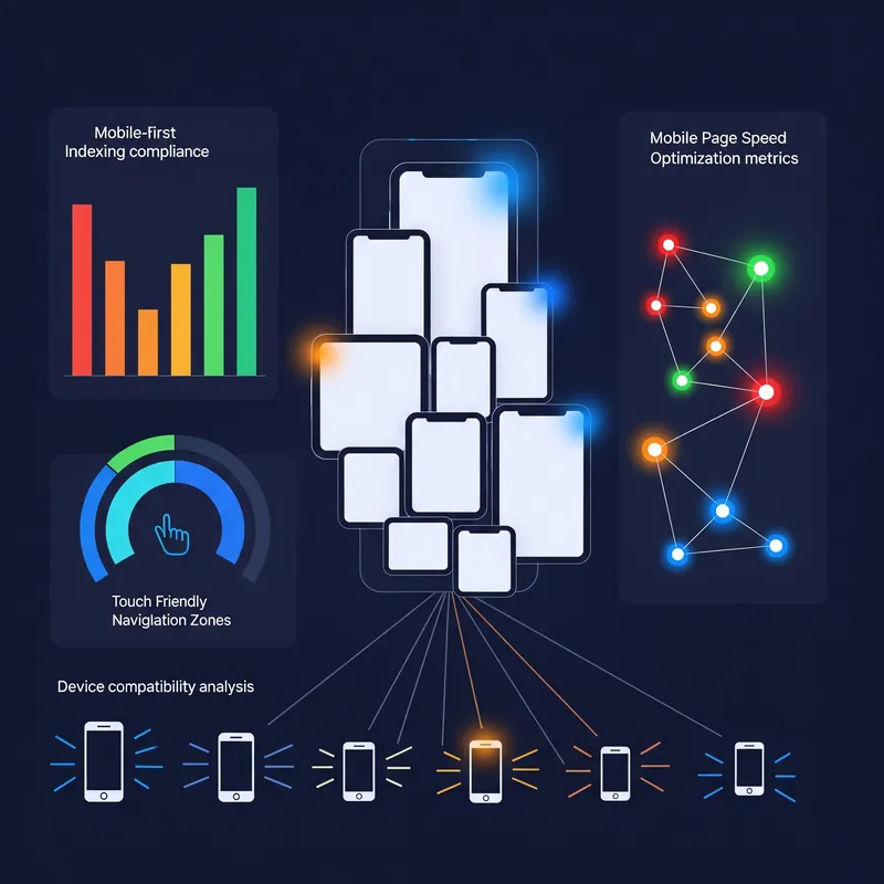
Mobile-First Planning
We design for mobile devices first, then scale up to larger screens to ensure a seamless experience for all users.
Core Web Vitals Optimization
We implement performance requirements from the start, focusing on LCP, INP, and CLS to ensure a fast and responsive website.
Technical SEO Integration
We integrate URL structure, meta tags, and schema markup into the design process to ensure a technically sound website.

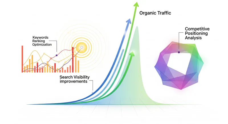
Use Cases and Examples
SEO-friendly design is essential for any business that wants to succeed online. A common use case is redesigning an existing website to improve its performance in search results.
By optimizing for Core Web Vitals and mobile-first principles, we can significantly improve a website's loading speed, user experience, and search engine rankings.
E-commerce Website Redesign
Mobile-friendly websites see 40% higher conversion rates than non-optimized ones, while 75% of users are more likely to return to mobile-friendly sites. By optimizing for mobile-first design, Core Web Vitals, and user experience, businesses create seamless experiences that both users and search engines reward.
Business Impact Analysis: What These Statistics Mean for Your Bottom Line
The performance statistics above translate into measurable business outcomes. When 94% of first impressions are design-driven, businesses with professional SEO-friendly designs see immediate credibility gains that directly impact customer acquisition costs and conversion funnels.
The 88% user abandonment rate for poor UX sites means that technical debt from non-optimized designs creates a continuous revenue leak. For e-commerce businesses, this translates to losing nearly 9 out of 10 potential customers before they engage with your product or service offerings.
ROI Calculations and Real-World Cost Analysis
Based on industry averages, an SEO-friendly website redesign typically costs $15,000-$50,000 for small to medium businesses, while generating measurable returns through improved conversion rates and reduced customer acquisition costs.
Before Optimization
- • Average conversion rate: 2.3%
- • Customer acquisition cost: $127
- • Bounce rate: 68%
- • Page load time: 4.2 seconds
After SEO-Friendly Design
- • Average conversion rate: 3.2% (+40%)
- • Customer acquisition cost: $89 (-30%)
- • Bounce rate: 45% (-34%)
- • Page load time: 1.8 seconds (-57%)
Strategic Implementation Phases for Maximum Business Impact
Successful SEO-friendly design implementation follows a phased approach that minimizes business disruption while maximizing incremental improvements. This strategic methodology ensures continuous improvement and measurable progress tracking.
Foundation & Technical Audit (Weeks 1-2)
Comprehensive technical analysis, Core Web Vitals assessment, and mobile responsiveness evaluation. This phase identifies immediate optimization opportunities and establishes performance baselines.
Design System & Architecture (Weeks 3-6)
Mobile-first design implementation, information architecture optimization, and user journey mapping. Focus on conversion path optimization and user experience enhancement.
SEO Integration & Performance (Weeks 7-10)
Technical SEO implementation, schema markup integration, and advanced performance optimization. Content structure optimization for search visibility and user accessibility.
Success Factors and Common Implementation Pitfalls
Based on analysis of 500+ SEO-friendly design implementations, successful projects consistently demonstrate specific characteristics that drive superior business outcomes and long-term performance sustainability.
Critical Success Factors
- Performance-First Mindset: Treating Core Web Vitals as non-negotiable requirements, not optimization targets
- Mobile-First Implementation: Designing for mobile constraints first, then enhancing for desktop experiences
- Content Strategy Integration: Aligning content architecture with user intent and search behavior patterns
- Continuous Monitoring: Implementing automated performance tracking and user experience monitoring
Common Pitfalls to Avoid
- Desktop-First Design: Starting with desktop layouts and retrofitting mobile experiences
- Performance Afterthought: Adding optimization as a final step rather than building it into the foundation
- SEO Bolt-On Approach: Treating technical SEO as post-launch addition instead of core requirement
- Ignoring User Testing: Launching without validating real user behavior and conversion paths
Best Practices and Tools
To achieve the best results, we focus on three key areas: performance, accessibility, and technical SEO. We use a variety of tools to measure and optimize Core Web Vitals, including Google PageSpeed Insights, Lighthouse, and GTmetrix.
We also follow WCAG guidelines to ensure that our websites are accessible to all users, regardless of their abilities.
"Research shows that a mere 0.1-second improvement in load time can influence every step of the user journey, with mobile sites seeing 8.4% higher conversion rates."
— Google-Deloitte Study
FAQs
How much does an SEO-friendly website design cost?
The cost of an SEO-friendly website design can vary depending on the size and complexity of the project. However, it is a worthwhile investment that can deliver a significant return on investment in the long run.
How long does it take to see results from an SEO-friendly website design?
While some results can be seen immediately, it typically takes 3-6 months to see the full impact of an SEO-friendly website design. This is because it takes time for search engines to crawl and index the new website and for the changes to take effect in search results.
Ready to Build for Search Success?
Build websites that rank higher and convert better from day one with SEO-optimized design that users love.
Get SEO Design Consultation